


INDUSTRY
REMITTANCE FINTECH
CLIENT
WorldRemit (In-house)
YEAR
2022
EXPERIENCE
CONTENT DESIGN
WorldRemit: Greenfield
about.
WorldRemit, a global remittance fintech, launched a Greenfield initiative to rebuild its app. The goal was to enhance the user experience, minimise transaction friction, and scale for a global audience.
I led content design across the entire product lifecycle, from discovery to delivery for the timely delivery of results on a tight schedule.
I collaborated with a team of UX designers, marketing writers, and product managers to create a user-centric content strategy, tone of voice and guidelines that became the north star for the product.
challenge.
WorldRemit users can transfer money from 50 send countries to 90 receive countries with over four receive methods. As the team built the features over the course of 10 years, content was added as needed, with no minimal audits or refreshes. There was a lack of information architecture and contextual wayfinding that led to issues for the user.
While facing transfer delays, cancellations and hold-offs, users required information and guidance. In case of its absence, they contacted customer service, which increased the cost of each money transfer.
Reduce transaction holds and cancellations
Improve onboarding and user conversion rates
Build trust through clear, simplified content
Create scalable content systems for global markets
audience.
WorldRemit positions itself as THE global financial services platform that connects aspirational economic migrants and their families with their money across borders through delightful experiences.
The primary user persona, defined as the Constrained Striver, is an individual who has migrated for work or education and regularly sends money back home. This emotional anchor shaped our tone of voice: empathetic, confident, and globally accessible.
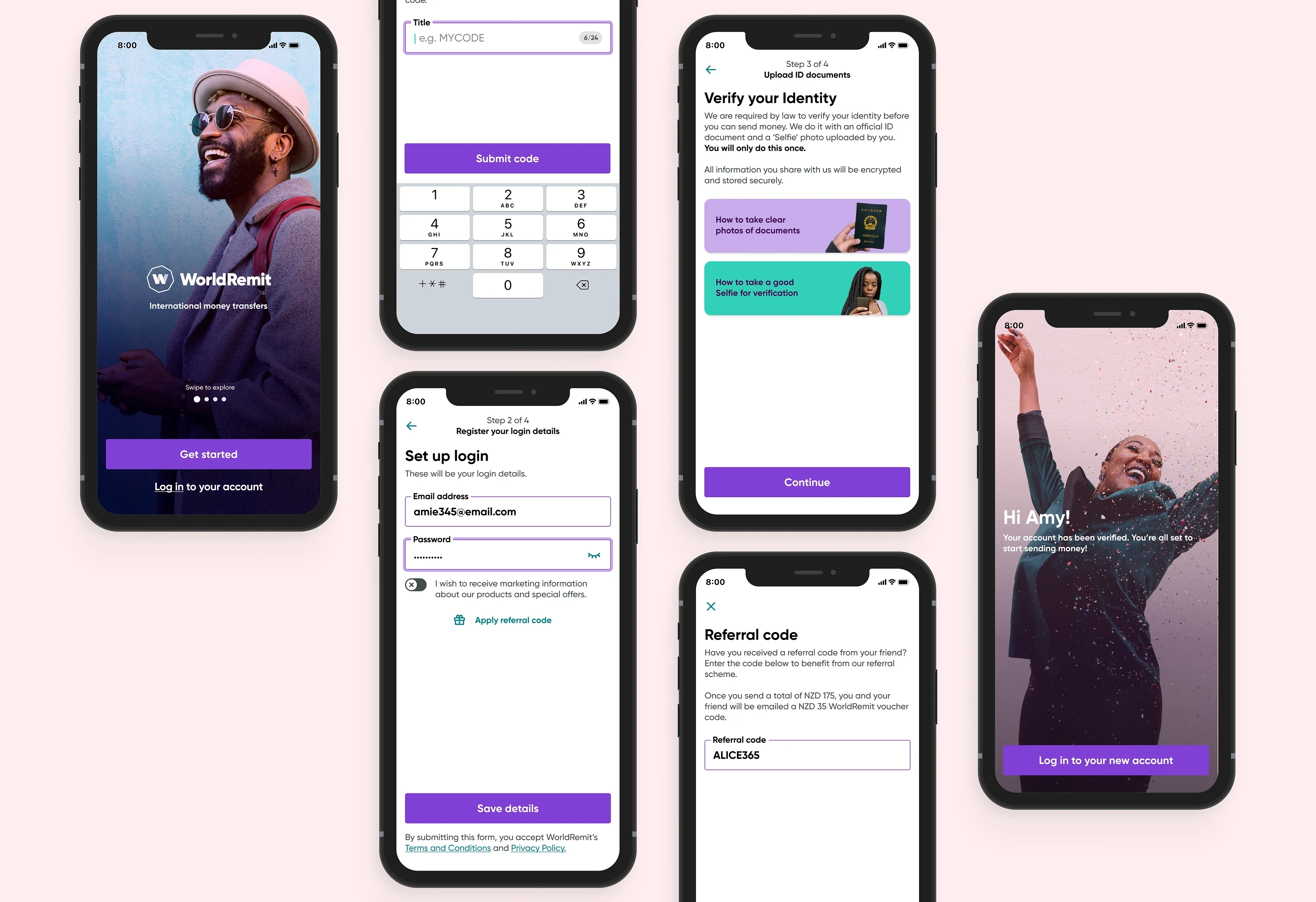
redesigning onboarding.
I began by redesigning the onboarding experience. Along with UX designers, I created low-fidelity designs that tackles the drop-off issue caused by existing compliance and tech. We played with two versions:
1. Single form that personalised your account as move through onboarding
2. That starts by creating an account with information such as email, password, and phone number and then moves on to a profile.
introducing new language.
To overhaul the app, we had to do the same for our terminology. We introduced some changes in the initial designs to test internally:
1. The mode of sending money was earlier termed as Transfer Method from the point of view of the sender. But as the receiver was our end user, I changed to the Receive Method.
2. The end benefactor, who was earlier referred to as the 'Recipient', was changed to 'Receiver', based on user interviews and market comparison.
3. All labels that denote the screen where users make a choice, as well as the choices made, are Title-cased.
As we move into the next stage of development, the headers were devised in two different ways:
1. Label: For a user choice
2. Action: A sentence guiding user to move with a subset of a choice
The Receive Method options will also lead to a capitalisation rule for label subheads. This was done to highlight action phrases and these decisions were made with A/B testing.
building the send journey.
Initially, the receiver information was filled into a long-form page that required scrolling. As the user fed information for its receiver, the drop-off rate would increase with every field.
This sparked research within WorldRemit regarding the merit of a multi-step receiver form. After 30 user interviews and external inspiration from other apps that were doing the same, the new app adopted the Multi-step form.
The classic app also didn't provide any guidance for the fields. We decided to add it in the initial launches to test whether it was helpful to users.
execution highlights.
Onboarding Flow
Introduced two onboarding prototypes (single form vs. traditional)
Added contextual microcopy, labelling and error handling
Result: Activation rate doubled from 60% to nearly 100%
Receiver Form
Replaced long-form with multi-step guided flow
Enabled resume-from-exit with extra content guidance
Result: Reduced drop-offs and improved clarity